You’re driving and you’re bored. Tired of staring at the road, your eyes drift toward the polished touchscreen to the right of your steering wheel—what the auto industry calls your “infotainment” system. First you scroll through its menus to select a pump-me-up playlist; then you use its mapping tool to reroute toward a nearby Starbucks.
Sounds like a typical driving experience these days. Sure, you temporarily looked away from the road while tapping through the infotainment system, but that’s no big deal. Right?
Well, it could be. You might have been distracted for as long as 40 seconds while changing your destination, according to an analysis by the AAA Foundation—long enough to cover half a mile at 50 mph. As for choosing playlists, one study found that drivers selecting music with Apple CarPlay or Android Auto had slower reaction times than those who were high from smoking pot.
“Today’s infotainment systems can be as distracting—if not more so—than personal electronic devices,” says Jennifer Homendy, the newly confirmed chair of the National Transportation Safety Board. The federal government blames distraction for around 10 percent of the 38,680 annual traffic fatalities in the United States, but that’s almost certainly an underestimate, since people aren’t inclined to admit they were fiddling with a phone or a navigation system prior to a crash.
The problem isn’t necessarily that infotainment displays are now a standard feature of all new vehicles; in theory, at least, they’re preferable to drivers squinting to read a phone while operating a vehicle. But these systems are rapidly becoming glitzier, more complicated, and just plain bigger, with some resembling supersized tablets attached to your car console.
Meanwhile, they’re essentially unregulated.
Staff at the federal National Highway Traffic Safety Administration are aware of infotainment’s risk of distraction, and they have advised carmakers to avoid egregiously dangerous designs and functionalities. But carmakers know that infotainment presents one of their best chances to stand out from competitors. “When you go to a dealership, it’s almost a given that the car will have a five-star crash rating, and that it accelerates and brakes quickly,” says Kelly Funkhouser, the head of connected and automated vehicles at Consumer Reports. “What makes a difference in the car you actually pick is the infotainment system.” That becomes even more true in a world of electric vehicles, which lack much of the sound and feel that seem to confer a unique character on cars with internal-combustion engines. (MotorTrend’s ranking of the model year’s best “exhaust sounds” doesn’t work for electric vehicles that emit no exhaust.)
Eager to differentiate, carmakers are constantly updating their infotainment systems with new and flashy designs, with touchscreens that look and feel like an iPad (Tesla), come with a redundant control wheel next to the cupholder (Genesis), and claim the ability to read hand gestures (BMW). “They’re all trying to define their separate worlds for how to do stuff,” says Cliff Kuang, a user experience designer and author of the book User Friendly. That may be a compelling business strategy, but it introduces new distractions and makes it harder to build muscle memory across vehicle models. “The more complex the infotainment systems get, the less people understand them,” Kuang says.
With American traffic fatalities recently hitting a 15-year high, an infotainment arms race seems like the last thing we need right now. The car industry is poised to give us one anyway.
Today’s drivers take it as a given that their cars allow them to receive phone calls, send text messages, and route their trips, but those functionalities are actually quite new. In 2010, the New York Times published a story about emergent safety risks as the “internet creeps onto car dashboards.” Ray LaHood, the secretary of the Department of Transportation at the time, was concerned that carmakers could “load automobiles with all kinds of ways to be distracted.” His fears seemed justified; some early infotainment systems allowed the driver to access social media or read restaurant reviews.
In 2013 NHTSA issued guidance establishing maximum lengths of time that infotainment tasks should entail (each task should be completed with glances of two seconds or less, totaling no more than twelve seconds), while recommending that particularly dangerous activities, like accessing social networks or watching videos, be blocked while the car is in motion. But the term “guidance” means what it implies—it is merely a suggestion, which automakers can ignore. An academic assessment published in 2017 found that many infotainment systems already created distraction that exceeded NHTSA’s recommended threshold.
Meanwhile, smartphones became nearly universal among car buyers, with an estimated 85 percent of Americans now owning one. Automakers have designed their infotainment systems to mirror mobile devices’ touchscreens, ditching the knobs and dials that came standard for decades. But that shift was a step backward for safety, since it removed the ability to complete tasks without looking down. “Tactile and haptic feedback is a big deal,” says Jason Torchinsky, author of Robot, Take the Wheel: The Road to Autonomous Cars and the Lost Art of Driving. “When driving, you should be looking out the big window in front of you.” Since you can’t feel what you are touching on a display, turning your head becomes necessary.

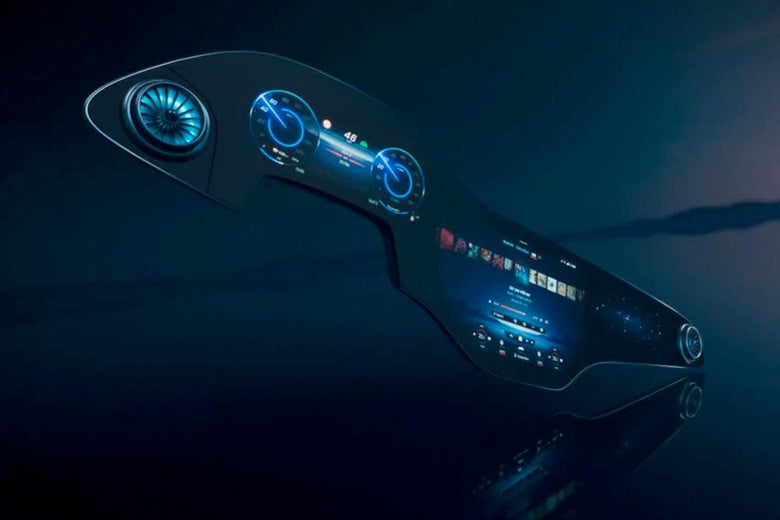
Mercedes
Researchers have demonstrated that touchscreens can reduce drivers’ visual awareness of their surroundings. They also increase the risk of errors. “Touchscreens and 65-mph bouncy highways don’t work very well together,” says Consumer Reports’ Funkhouser. Voice-activated systems are also notorious for misreading verbal commands. Such errors are a bigger problem than they may seem. “Frustration can arise if the system can’t recognize what you’re trying to do,” says Bill Horrey, traffic research group leader of the AAA Foundation. “That can impact safety as well,” with an annoyed driver paying less attention to his surroundings. As a result, larger infotainment screens, like Mercedes’ new 56-inch Hyperscreen, can actually be safer than smaller ones because they make it easier to find the function you’re looking for. Another aspect of Hyperscreen that safety experts applaud: its “zero-layer interface,” which avoids submenus that require additional effort to navigate.
Today, infotainment touchscreens and voice-control options are near-universal, and virtually all systems are compatible with the interfaces of Apple’s CarPlay and Google’s Android Auto (loathe to surrender control to the tech companies, carmakers also offer their own interfaces and app stores). But beyond those commonalities, the systems vary widely in their screen dimensions, placement within the vehicle, and control menus.
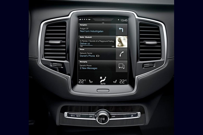
Seemingly well-intentioned infotainment design decisions could compromise safety. Volvo’s Sensus system, for instance, has required the driver to use a touchscreen to confirm voice-activated commands. “If I wanted to call a person, the system would require me to visually confirm whether I wanted to call his home or work number,” says Ian Reagan, a senior research scientist with the Insurance Institute for Highway Safety. “Effectively, it’s a request to take your eyes off the road.” Reagan also noted an Acura design with two separate touchscreens. “The driver often didn’t know exactly where to look. It’s just confusing.”

Volvo.
Another problem: Many vehicles’ infotainment systems revert to a home screen if a driver fails to complete a multistep task (like choosing a podcast episode) within a few seconds. “We should let people decide when to take their eyes off the road,” says Consumer Reports’ Funkhouser.
It’s hard to say exactly how dangerous today’s infotainment systems are—both because we lack good data, and because some drivers can handle distractions more easily than others. A study by the AAA Foundation found that older drivers typically require significantly more time to complete tasks. Young people are also more vulnerable, says AAA Foundation’s Horrey, because of “social connectivity with friends and FOMO coupled with driving inexperience.” The risk of conducting a particular task within a specific infotainment system’s design will vary from driver to driver—but it will always be there.
There is no standardization around infotainment; how you place a phone call to your brother’s cell phone in one vehicle tells you little about how you might do so in another. As a result, a driver renting, borrowing, or buying an unfamiliar car must climb a learning curve as she figures out how to navigate the system. When that person is guiding a three-ton box of metal hurtling down a street, a learning curve is dangerous—both because she takes more time to complete a task, and because she might simply give up and use a cell phone disconnected from the car.
This ongoing threat of cell-phone use looms large over infotainment safety discussions. Human-factors experts generally agree that completing a task on an infotainment system is less dangerous than on the small screen of a smartphone (which is designed to retain the user’s attention, rather than return it quickly to driving, as an infotainment system should). “You don’t want the driver to say ‘screw this’ and use their cell phone instead,” said Scott Schmidt, the vice president of safety for the Alliance for Automotive Innovation, an industry association. “If a customer gets upset, they can pick up their phone and have their mapping tool right there.” The same is true if the driver is determined to use an app like TikTok that the infotainment system doesn’t support—she can always reach for her phone, even if doing so is illegal.

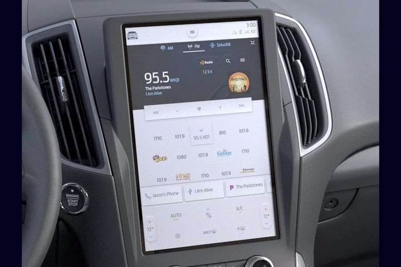
Ford.
That brings us to a worrisome future risk. As today’s teens and 20-somethings become the heart of tomorrow’s car-buying market, automakers will sell into a customer base that is native to mobile, accustomed to video chats and social media. Could a carmaker spot a market opportunity in being the first to ignore NHTSA’s guidance and build dangerously distracting functionality into its infotainment system? Already, a handful of YouTube videos depict Tesla drivers appearing to use their infotainment system to play video games and surf the web while the vehicle is in motion (Tesla has previously broken generally accepted safety norms around driver assistance systems). Kuang, the user design expert, thinks the risk of a reckless-by-design infotainment system is real: “The first carmaker who says ‘Hey, you can consume social media while you drive’ is going to win in the market.”
That isn’t the only cause for concern. Automakers are currently racing to develop so-called Advanced Driver Assistance Systems, such as lane-keep assistance and automatic braking, which leave the driver with fewer tasks to occupy his time—even though he is still expected to slam the brakes or turn the steering wheel if the situation requires it. With less to do, fidgety drivers are more likely to turn to their infotainment system—and potentially clamor for new functionality, like videoconferencing, that NHTSA has warned against. Will automakers continue to heed that guidance?
When I called Jennifer Homendy, the new chair of the National Transportation Safety Board, I caught her while she was driving along a North Carolina interstate. She declined my call, returning it only after she had pulled over outside a Quality Inn. “Even if you’re using the speaker for the call, it’s still not safe,” she told me (she has a point: researchers have found that drivers can be distracted for up to 27 seconds after a phone call ends).
Safely parked, Homendy shared her concerns about the growing variation across infotainment systems. “They’re all so different. There has to be standardization,” she says. “If we don’t move beyond NHTSA’s guidance, we’re only going to have an increase in fatalities.” Torchinsky, the car-guy author, agrees. “I would love to see a standardization of basic control systems for infotainment,” he says.
But standardization would require automakers to cede control over one of the most distinctive elements of the driving experience. “Carmakers are incentivized against being user-friendly, because that would require not changing where things are [within the vehicle],” said Kuang. “That means they can’t sell cars.” Any federal official seeking to force consistency in infotainment design can expect a battle royale. Schmidt, of the Alliance for Automotive Innovation, cited technological progress as a reason to keep using NHTSA’s 2013 suggestions: “The state of infotainment knowledge is changing so fast that I don’t know if we’re ready to say ‘here’s the next [federal guidance].’” (NHTSA declined a request for comment.)
But even if a mandate is politically challenging, NHTSA could still take incremental steps, such as incorporating the vehicle’s risk of distraction into the government’s NCAP crash safety ratings, which are already overdue for a rewrite. Homendy sees merit in that idea: “The best way to get manufacturers to prioritize safety is to create consumer demand,” she says. “And demand comes from safety ratings.”
Rather than focus on the system’s design, the federal government could instead require safeguards that ensure the driver’s attention doesn’t wander dangerously (recall that some individuals are less distractable than others). So-called driver monitoring systems are already used to ensure that the driver remains attentive while an Advanced Driver Assistance System is in use; otherwise the car will issue a warning or bring itself to a halt. Driver monitoring systems aren’t generally utilized outside of driver-assistance deployment, but they could be.
Of course, safety concerns around infotainment become moot in a world of fully self-driving vehicles, which remove all responsibilities from the person behind the wheel (if there is even a wheel at all). But the timeframe for such driverless vehicles keeps being pushed back; it’s generally seen as still being years (if not decades) away. The pursuit of autonomous driving is unlikely to resolve the distraction conundrum anytime soon. If anything, it could worsen it; the safety driver behind the wheel of Uber’s prototype autonomous vehicle was watching an episode of The Voice on her phone when the car struck and killed Elaine Herzberg in Tempe, Arizona three years ago.
For the foreseeable future, at least, automobiles will continue requiring the driver’s full awareness—even as automakers keep redesigning their infotainment systems, forcing drivers to relearn how to use them, and introducing features like Ford’s in-system advertisements that create new competition for the driver’s attention. Automakers can be expected to keep tinkering with their infotainment designs, which offer one of the few remaining pathways toward differentiation. “They all believe they can come up with something great, and they’ll keep trying,” predicts Torchinsky. The risks of that quest will fall on all of us.